
The Problem
Due to covid travel restrictions, I took a road trip in the Summer of 2020 to explore Austria for vacation...and unfortunately so did everyone else.
In a time when international travel is risky, limiting impact on the environment is a top priority and domestic tourism is a vital contribution to saving the local economy, vacationing by train could be a great solution.
How might we encourage people (and myself) to use the train instead?

The Process
In an intensive 2 weeks, I conducted user research, defined my target persona's user journey and jobs to be done, iterated through low- and high-fidelity designs, and conducted usability testing.
The Solution
An app for the national train operator, ÖBB, more suited for people new to Austria with:
A destination discovery tool and the option to save favorites.
A more transparent ticket search with a price toggle that makes discount benefits more obvious to users (esp. newcomers).
1. Research
Initial Online Research
I looked at travel forums, Facebook groups and reviews of the national train provider ÖBB for my initial hypotheses.
I found many people like me who did not know Austria very well and were asking for tips on where to go. There also were often discussions on whether taking the train and purchasing the ÖBB Vorteilscard (an annual discount card) was worth it.
Hypotheses
1. People new to Austria do not know local vacation spots
2. People new to Austria are unsure of the value of the train and the ÖBB Vorteilscard
Interviews
I interviewed 5 people: a mix of locals who were born and raised in Austria, and newcomers who arrived less than 3 years ago. Ages 25 - 35.
For each interview, I also asked the participants to imagine their dream trip in Austria and to go through the booking process on the ÖBB app using the Think Out Loud method.
Main Findings
1. ÖBB booking process is not newcomer-friendly
Interviewees new to Austria relied on Google & Google Maps to find vacation spots before they can start booking, then each step of the process has information they do not know or understand
2. ÖBB's pricing/discount info is confusing & hidden.
Interviewees new to Austria relied on Google & Google Maps to find vacation spots before they can start booking, then each step of the process has information they do not know or understand
2. Defining the requirements
Empathize
Using insights from my interviews, I created (1) a newcomer Persona, (2) Jobs to be Done, then (3) a current state Customer Journey Map:
Persona: Using insights from my research, I created a persona to target my design solutions for newcomers in Austria who are unfamiliar with local destinations and ÖBB's train booking services.

Jobs to be Done: to under the desired outcomes from the perspective of a newcomer

Customer Journey Map: Using Sara"s JTBDs and my interview data, I mapped what stages and steps a newcomer like Sara would go through to book through ÖBB. I used thoughts expressed by participants as well as online reviews for the ÖBB app to identify pain points that need to be improved and functionality for my solution.
Idea💡 ÖBB Railtrips
ÖBB currently offers 3 different apps, but they're all for locals who know where exactly they want to go.
So, I imagined a new app that helps newcomers plan & book vacations.
Core Functions
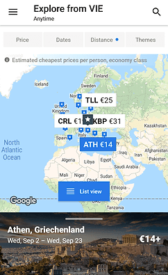
1. Destination Discovery Tool
A visual map tool to help users find and filter destinations to book directly or save for later
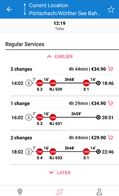
2. Clear Pricing & Discount Info
Users can find and learn about pricing levels while they are in the booking process
3. Ideation
Design
I looked at ÖBB and various travel-related apps for design inspiration and to understand the information I need to incorporate in a train booking app.
Swoodoo
I thought that a map tool like this would be a great solution considering how much my interviewees relied on Google Maps and photos

Wizz Air
I wanted to incorporate a more intuitive way for people to "turn on" discount pricing to compare differences
ÖBB Wegfinder
I used this app to make sure I show the necessary trip information
Initial Concept
I created a task flow to understand the basic necessary steps and then drew sketches of the main screens:


Wireframes
After some feedback and making improvements, I created high fidelity wireframes using Figma for user testing:

4. Testing & UI
feedback, refine, reiterate
User Testing
I conducted user testing with 4 people new to Austria and unfamiliar with ÖBB.
I tested the usability of my prototype using the Think Out Loud and First-Click methods, and I asked questions regarding their attitudes and trip habits. The insights helped me to create my final high fidelity interactive prototype.
Main Learnings
1. Simplify & Focus
I took out the raised ticket button on the bottom navigation and the "recommended" section as they were causing confusion and did not add to the intended value of my app. These could be additional ideas to be tested in future interations instead.
2. Avoid Disruptions
One of my main goals was to help users see the benefits of different pricing levels and available discounts. I found that by having a popup dialog box to inform users that they can click on the price to see other options, they were disrupted from their booking flow. So I opted to create a toggle button to improve on Wizz Air's discount club check box, so that users can easily see pricing differences with this tool without any popups or clicking out of their flow.
The Solution

1. Home
Book directly or go to Discover map tool
2. Discover
Map view by default
Main filters: Price, dates, distance
Destination (Hallstatt) card -> slide up to view details
Show distance from origin next to destination
Swipable photos in destination details
Activities icons in destination details
Book, share or save place for later
3. Booking
Prioritize ticket pricing & times
Immediately see pricing levels & benefit
Price toggle to see Vorteilscard price
4. Saved
Share or save trip info for later
Switch between places & trips (with travel info)
UI Considerations
I stuck to ÖBB's brand & colors, but made the elements cleaner, friendlier and more modern. The red and white brand colors were tricky to design with, as red usually signals danger and draws a lot of attention. Therefore, I kept the use of red to a minimum while still keeping close to ÖBB's web UI. At the time, Android phones were more popular and accessible to customers around the world, so I chose to use Google's Material Design UI guidelines.
Tester insights
Is the prototype delightful?
Testers loved the Discover map & saving tools.
Is it easy to use?
Very smooth usability testing with final version.
Does it help user goals?
3 of 4 testers responded that they would likely use this for their next vacation & recommend it to a friend.
Does it help business goals?
3 of 4 testers expressed interest in ÖBB's Vorteilscard & saw the train as more affordable after using prototype.
Major Lessons
I wanted to speak to someone at ÖBB to understand what kind of business goals and pains they had especially now with the pandemic. I also wanted to make sure that I understand their service offerings, since they have so much.
Instead, I had to base my solution around my own assumption that they are interested in selling more Vorteilscards and promoting their discount prices to the public, while they may have other priorities.
Everyone is different
Even though I designed my solution for people like me (new to Austria and vacations regularly, between 25-35 years old). It was still surprising to see when some testers don't understand certain icons and UI styles. Furthermore, one of my testers showed complete disinterest in train travel, which would be interesting for future research, to see why and if it's possible to attract them as customers.
This highlights the need to define user segments and conducting usability testing as often as possible.
Focus, focus, focus
With the extremely limited time that I had I wanted to focus on a very simple Minimum Viable Product to focus my testing and improvements. Still, in my ideation and sketching I still managed to tack on features that may have been nice to have but turned out to be more confusing than valuable. These were dropped later so that I can focus on making at impact with my main features, but it has become clear that this is an important mindset that requires practice.