Redesigning Ledgy's employee equity dashboard

Summary
Ledgy offers customers’ employees access to a personal account where they can view their equity compensation, but the user activity was low. I uncovered major user needs and transformed the legacy MVP by tailoring the data and visualisation to the audience.
Key results
Design process
My role
As the sole product designer on the project, and 2nd designer to join the company, I helped establish user research and design thinking processes that helped the team make more user-centered decisions based on real data.
Company
Ledgy is a fintech B2B SaaS startup
Team
1 Product Manager, 4 Engineers, 1 Data analyst
Timeline
1 quarter for discovery, user testing, design & development
Identifying the problems
Initially there were many ideas floating around to engage employees, but nobody was sure what to do. After conducting a workshop to understand the status quo and with the help of customer feedback from CX, I spoke to 5 employees using interviews, usability testing and card sorting to understand:
What do users know or think about their equity?
What do they want to know?
How useful is the current employee app?


User insights
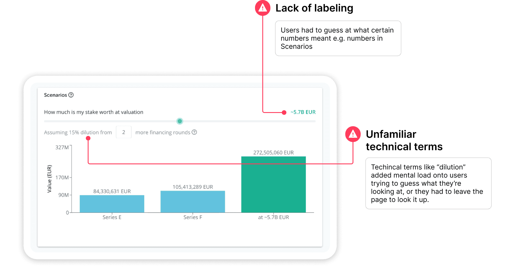
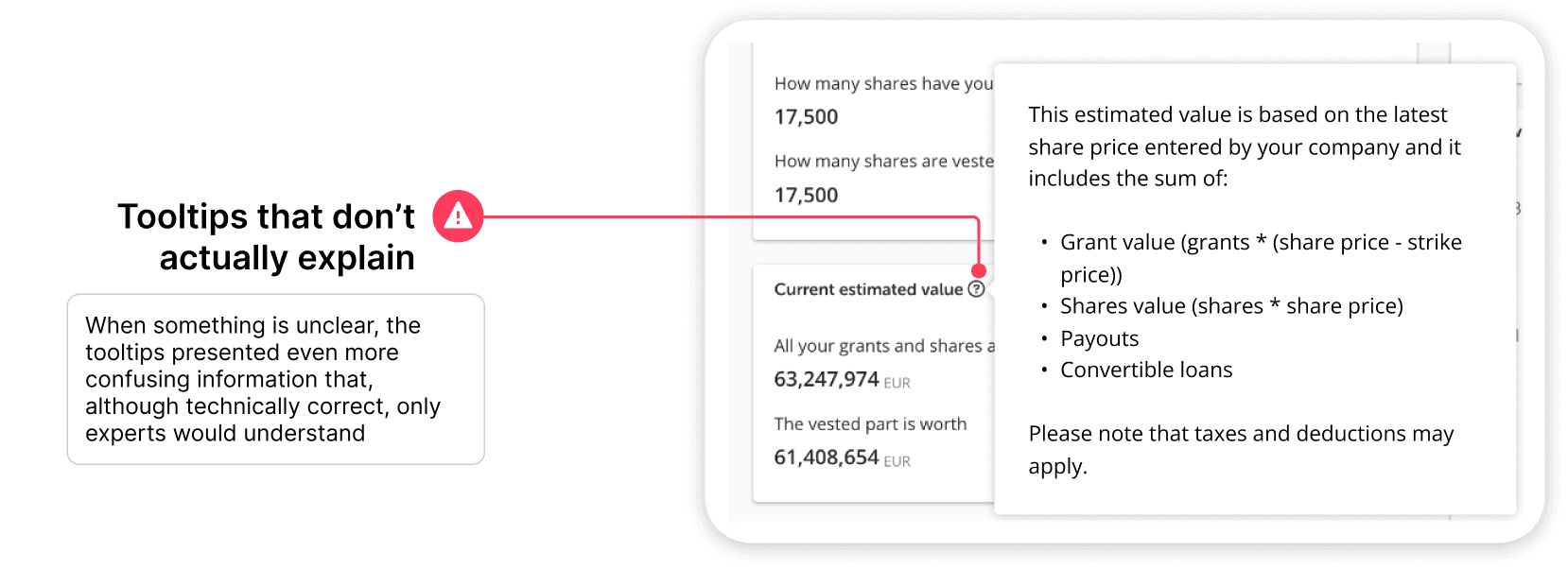
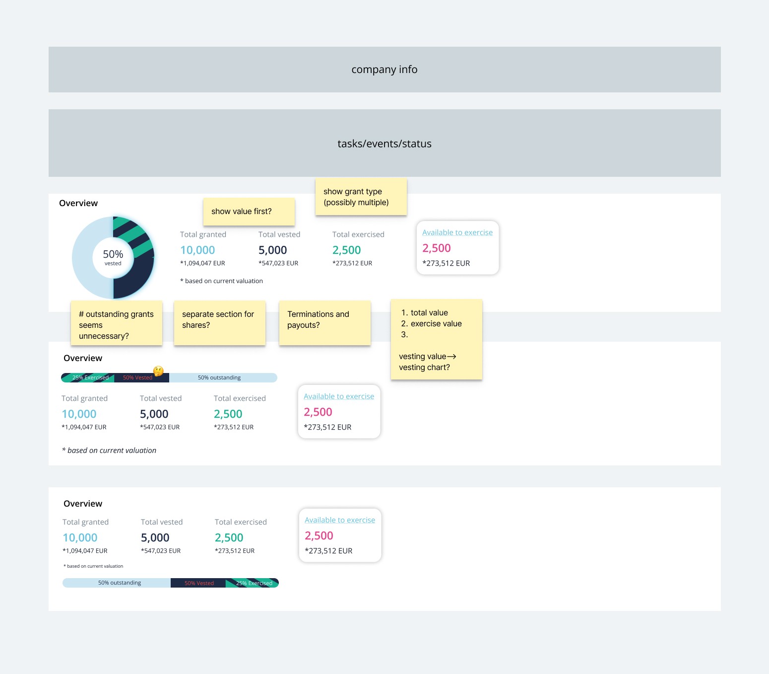
The most eye-opening insights came from usability testing the original dashboard, where testers were visibly confused and had difficulty using the dashboard to answer basic questions.
The dashboard was too advanced. The typical employee is much less informed on equity than the staff at Ledgy who created the dashboard, so it’s hard for them to grasp the complex concepts and jargon. Furthermore, the layout & visuals offered little help for users to connect the dots, and some things made it even more confusing:


Defining the strategy
Previously, some believed that we needed to educate employees on advanced equity topics. But research indicated that these may intimidate most users, and that there is a much bigger pain point to be addressed.
So instead, we decided to improve the employee dashboard with more feasible, frontend changes, so that employees can independently learn about their equity using Ledgy, and reduce manager workload.


Brainstorming as a team
Design iteration
Due to the high complexity, I refined my ideas closely with engineers using low-fidelity designs as they conducted technical research.
Since the design team was concurrently working on a rebranding establishing a design system, I adapted UI decisions accordingly.

Further learnings
Using a lower-fidelity mockup, I tested my ideas with early employees to check usability, and spoke to customers to gather feedback. These learnings helped me form my ideas towards the final design.
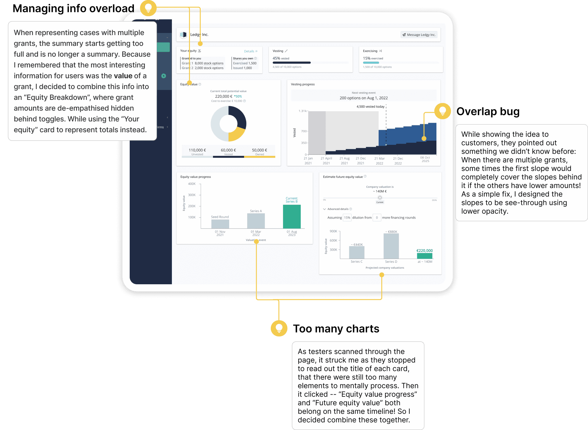
Final design
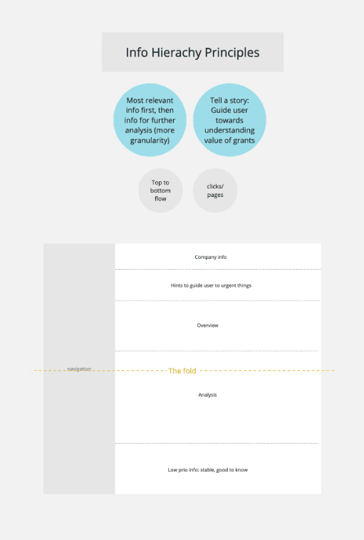
The new dashboard is tailored for equity beginners rather than experts: It now has an information architecture with the data following a logical flow with increasing complexity from top to bottom. The data users are interested in are highlighted, whereas less important pieces are de-emphasized. I further tested the designs with recent employees to validate the concepts.
Leveraging the top area where eyes tend to go first, I placed a "Your equity" summary, to give the user an overview of their data.

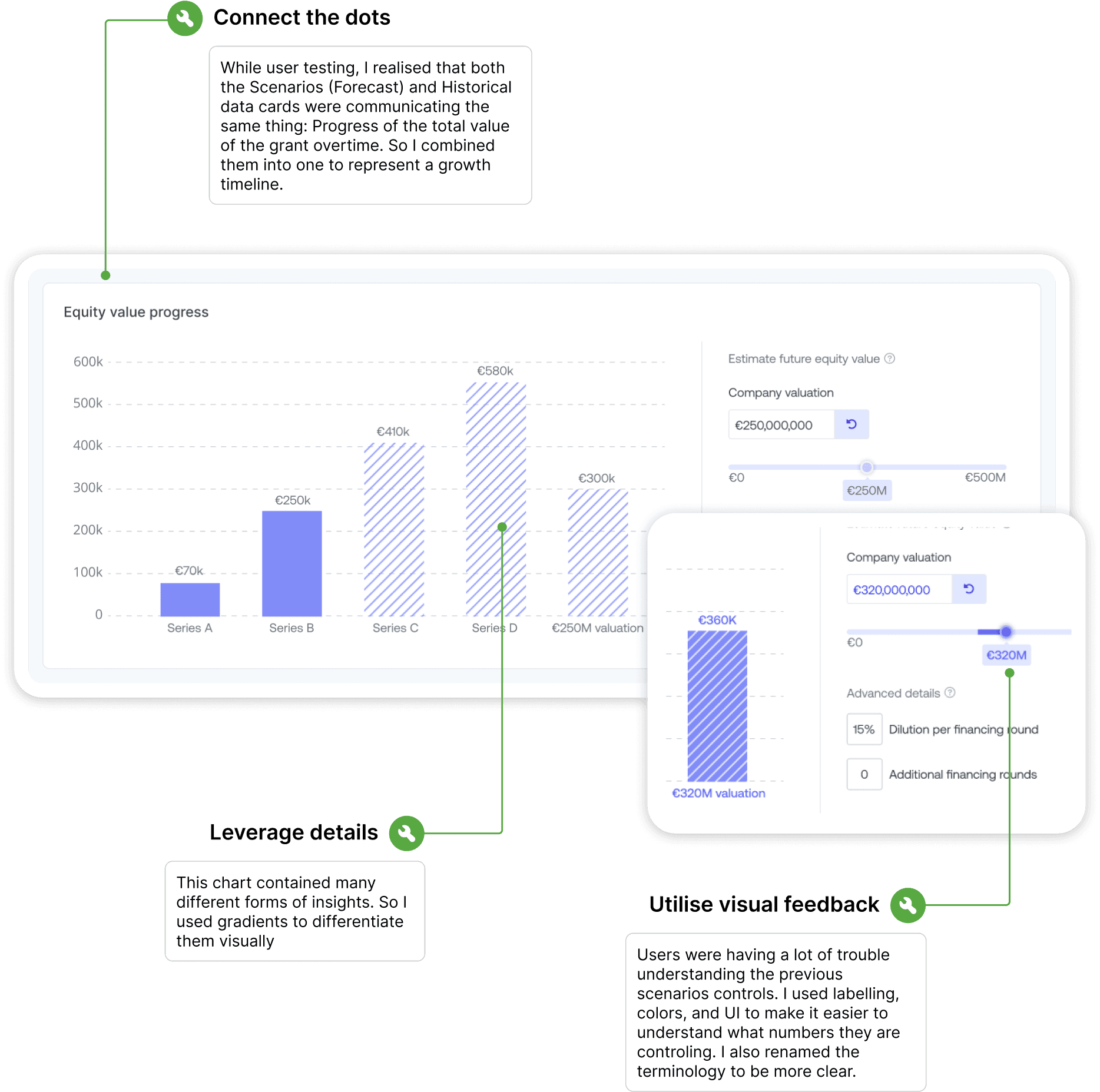
As the eye continues lower on the screen, that's when we can start getting into more detailed analysis, so this is where I placed "breakdown" cards:

Here, users can look back at previous grant valuations, see future estimates provided by the company, and play with their own forecasts.
Results
In addition to the overwhelmingly positive internal and external feedback post-launch. In the following months, we saw very positive results in the micro-survey I implemented, as well as user traffic data.